Wednesday, 28 April 2010
Wednesday, 20 January 2010
Sunday, 17 January 2010
Monday, 14 December 2009
Names for the magazine
Music world: This was another idea I had for my magazine name as I was planning on doing a magazine which coverd all types of music from around the world. I throught this name would be good as it is clear and easy to understand what is in the magazine. However after doing further planning I realised that it would be very hard to set up a magazine that does all diffrent types of music so i stuck with one. That is why I didnt choose this name.
Wednesday, 25 November 2009
My reader profile
My reader profile
My magazine is read by mainly males aged 16-20 but there are a few females that read it. People who read my magazine enjoy watching Scuzz TV and KERRANG! TV. The average reader will go to at least two gigs a month if they have the money as the average amount of money they receive is £87. They will also enjoy to listen to Planet rock radio station but as they all own mp3 players, they would much rather listen to that. Nearly 100% of people who read my magazine, like to go out on the weekends and enjoy hanging with their friends. The main source of my reader’s income is from their parents but 45% of them have part time jobs. £25, on average, of their income is spent on shoes per month, £30 pounds on cloths per month and £25 on music, games, DVD’s and films. Nearly every reader has the internet and the average time spent on it a week is over 10 hours. Over 60% of readers enjoy playing computer games and the average amount of people living in their house is 4. 75% of people download their music from the computer and the others prefer to buy it. My average reader will enjoy listening to Planet rock but will also like to listen to BBC 4. They will laugh at obvious humour of Family Guy but also understand the wittiness of Qi.
Sunday, 15 November 2009
Questionnaire for music magazine
1. What music types do you like?
R ‘n’ B Metal Pop Grime Indie Rock
Other -______________
2. What are your interests? (hobbies) __________________________________________________________________________________________________________________________________________
3. How much money do you get a month?
________________________
4. What features would you want to be in a music magazine each week?
___________________________________________________
5. What are your favourite bands/artists? _________________________________________________________________________________________________________________________________________
6. How much money do you spend on shoes each month?
_____________
7. How much money do you spend on clothes each month?
______________
8. How much money do you spend on music, DVD’s and books a month?
_____________
9. Do you have the internet?
Yes No
10. How much time do you spend on the internet a week?
0-1 hours? 1-2 hours 2-3hours 3-4 Hours 4+ hours
11. Do you play computer games?
Yes No
12. How many people live in your house?
______________________
Yes No
What do you enjoy to do over the week end?
________________________________________
How do you get your music?
Download Buy from a shop
What features would you like to see in a music magazine?
__________________________________________________
To find out what type of people would read my magazine, I handed out a questionnaire to 10 males and 10 females. I used 10 males and 10 females because I wanted to make sure that my sample size was an equal amount of males and females so that it was a fair test. Although my original idea is to target it more at males I believe that having females views may help the production of the magazine. As an original idea I wanted to make my magazine to appeal to 16-20 year olds so that’s the age range I asked.
I asked what music genre everyone prefers and 55% of people said they prefer rock music so my music magazine will mainly be based on rock music. Also 20% of people said that they like metal so I will include a small section about metal. People also said that their favourite things to do on are going to gigs, going out and going shopping. The average amount of money someone gets a month is £87 so the people who read my magazine are not well off but are not too shy of a penny. 55% of my readers get their money from parents so they show that they are not a reliable source. The other 45% get their money from part time work.
The average reader would spend 25 pound on shoes each month, £30 on clothes each month and £25 on music dvds and books. 100% of all the people that I asked use the internet so advertising on the internet would be good. The average time that people spend on the internet is over 10 hours a week. Over 60% of people play computer games and the average amount of people who live in the house hold is 4. 87% have their own mp3 player and 75% download music instead of buying it from a shop.
Brief Reader Profile
Friday, 6 November 2009
Reader profile comparison
The two reader profiles that I will be comparing are “The Word” and “NME”. Both magazine are aimed at men but word is aimed at 30-35 year olds where as NME is aimed at 17-30. People who read word earn a lot of money and they spend around £90 a month on music, films and books whereas people who read NME read spend around £1229 on audio equipment per year so they would also listen to a lot of music. NME also attract people who spend £66 on DVDs. This shows that both magazines attract people who are into the music and films.
People who read NME spend around £108 on games and £197 on consoles a year which shows that NME is intended for younger people because video games are targeted at a younger audience where as in Word there is no mention of games or video games. Both magazines have a target audience of ABC1 males which shows that there not looking for a high class audience just the general Joe Blog.
52% of people who read NME are full time employed but 29% are still studying where as everyone who is reading word are under fulltime employment and 44% earn over £50,000 and 11% earn over £100,000 a year. 94% of people reading NME use the internet and 76% have broadband. This shows that advertisers could use the internet to advertise NME because that age range would be browsing on it.
Thursday, 5 November 2009
Tuesday, 3 November 2009
Music magzine comparison for main task

The two types of magazine that I have chosen to compare are both musical but very different types of music. The first one, KERRANG! , focuses more on rock music going from soft rock to metal. My other choices was, CLASSIC FM. This, as the name suggest, focuses more on classical music. The audience for KERRANG! would be aimed at teenagers to around the age of twenty five. This is because the main audience are more likely to be into the heaver type of music and they are more likely to go to gigs. CLASSIC FM is mainly aimed at an older audience around the age of 50 plus. Also some students would need to listen to classical music for their course so CLASSICAL FM has a bigger target audience in that scenes.
The purpose of KERRANG! is to entertain and to inform people about what is going on in the rock music scene. The purpose of CLASSIC FM is the same as KERRANG! but to inform about the classical music scene. KERRANG! is published by Bauer Consumer Media which are a German company which operates in fifteen different countries. The Classic FM Magazine is published in the UK each month. It is the printed organ of Classic FM, a British classical commercial radio station. As such it reviews classical recordings and live performances and often includes tracks from recent releases on its cover disc.
The name “KERRANG!” is called that because they say that this sounds that an electric guitar makes when it smashes. CLASSIC FM is called CLASSIC FM because it is named after the radio station which in recent years has become very popular. The dominant feature on this magazine is the big “30”. This would attract people because people know of the band ’30 seconds to mars’ and they haven’t released an album in while so people will be like “oh maybe there is information released an album in while so people will be like “oh maybe there is information released an album in while so people will be like “Oh maybe there is information about their new album”. Classic fm’s dominant feature is the image of Bartoli. This is because it takes up nearly half of the front page of the magazine.
The main image on KERRANG! is of the band 30 seconds to mars. The shot type is a mid shot as you can the top part of their torsos. The background of the main image is very plain and simple which puts more emphasis on them as a band. This could also imply that if there is detail on their new album that it might be very plan information just like the background. The front man of the band has his heads in front of the title. This shows that they want people to see the picture as the main point of the front cover. They are represented as a stern band that are quite angry as they don’t really have a facial expression. The other main image on the page is of the man signing the women’s breasts. This would attract male readers as sex does sell to a man audience.
The main image on the front cover of Classic FM is of a mezzo-soprano singer called Cecilia Bartoli. They have used a mid shot again as you can see just over half of her torso. Her facial expression tells us that she is a happy person and that she enjoys singing. The background looks like she is in a relaxed environment like a bed room which shows us that she is not an aggressive person.
To draw people in, KERRANG! says things like world exclusive and “we’re not done”. The phrase world exclusive suggest to us that they are the only people who know this information. Also the phrase we’re not done shows that there will be information on a new album, or tour dates for this band so people would want to buy this magazine. The unique selling point for KERRANG! is the free posters they give away. This would make people buy the magazine because they would want the free posters.
Classical FM tells us that there are “exclusive interviews” in their magazine. This would make people buy it because of the word “exclusive”. This would make people believe that the only place to read these interviews would be in the magazine which would mean they have to buy it. The unique selling point of classical fm is the free CD. People would want to buy this because of the free CD. On both magazine front cover, not everything in the magazine is on the front cover because that’s what the contents page is for.
The contents page for KERRANG! is put into eight different section which represent what subjects are in the magazine e.g. News and live reviews. The information isn’t too small because it’s a weekly magazine so it isn’t that big. I think it’s clear because the font is bold and a good size. The contents page for classic fm also has clear information and it is a clear font. The size is good and clear to read.
KERRANG!’s content page wouldn’t attract me to buying it as I would normally judge it buy its front cover but the contents pages would sell because its clear and easy to see what’s inside it. The contents page for classic fm wouldn’t sell to me either because of the same reason but even if I did look at the contents page I wouldn’t because I think the writing is to small.
The percentage of advertising in KERRANG! is around 12 percent. The rest is either about music or about gigs happening. 27 percent of pages in classic fm are advertising plus there was lots of leaflets so there would probably be around 35 percent.
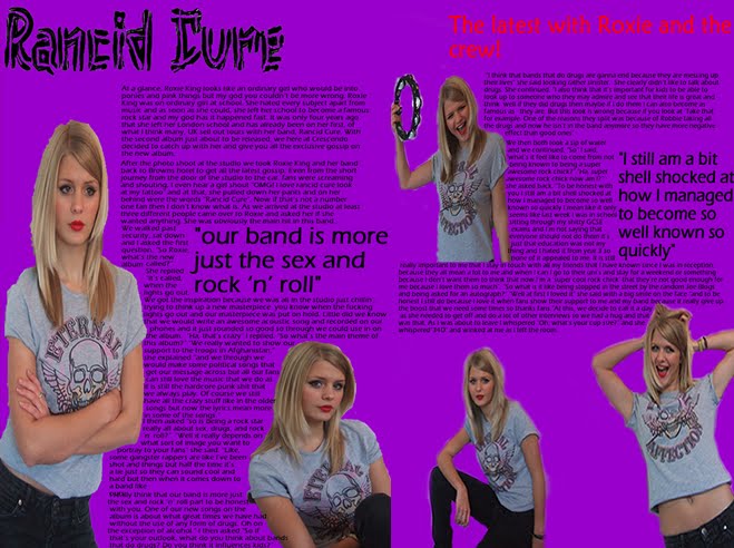
The main article is of a band 30 seconds to mars. They have chosen this because they have not realised anything recently and people will want to find out about it. The main article is about Bartoli. This has been chosen because people want to find out this famous singer.
The main article in KERRANG! is presented with mainly pictures but there is writing but it is small. This is because it is more attractive to the reader because pictures are more attractive than words. The main article in classic fm is presented with lots of big pictures and some small writing. This again would attract people because they can then see more pictures. The language in KERRANG! is very in formal as it uses bad language. This is because people who listen to rock don’t care about the language they use and they can just swear all they want. The language for classic fm is much more formal as normally older people would read it and them normally think that swearing is wrong.
Tuesday, 27 October 2009
School magazine evaluation
I have leant that planning a task like this is very important as it helps you think about what you need to include and what features should be used. I have leant that when you design a magazine it is important to come up with a drawn version of it first so you can see what it may look like and then decide what changes you think it would make it look better. Doing this task, I have learnt allot about using programs such as macromedia fireworks. This means that when it comes to producing the main music magazine I know more about fireworks and how I can make it look better and get a better grade.
I think that my product is quite well designed because it doesn’t have more than three different colours on the front page or the contents page. I think that the colour of the writing over the picture of road runner could have been a different colour as it is quite hard to read what it says. I think putting the yellow writing over the black was a good decision as it is easy to see and quite pleasing on the eye. As my magazine was a Halloween special, I think that having the masthead designed like it was, was a good idea because the cob webs give it a scary feel and you can easily tell that it is a Halloween special. I think having a USP (unique selling point) was a good idea as it would make the magazine more attractive to readers ad people who are not sure if they would want to buy it. I think that if the front page had more pictures on it then it would look more attractive.
In the contents page, I have stilled stayed with the same colour scheme as this makes it look neater and more attractive. I think that I have got the right amount of pictures on the contents page because if I had to many then I wouldn’t be able to fit all of articles on and if there was any less then it wouldn’t look as good. I have stuck with the three colours scheme and still using the same scheme as the front page. I think that the picture of Miss Brookes in the bottom left hand of the page could of been bigger and more clearer.
In the main task I will make sure I do allot more planning and will make sure I ask a bigger sample size when it comes down to my questionnaire because then I know what more people want rather than just what I think looks good. I will also make sure that all the colours all blend in well and that everything is still easy to read.
Wednesday, 21 October 2009
Questionnaire
Magazine Names
Tuesday, 13 October 2009
Magazine research


Our first task was to create a school magazine. This was our preliminary task. At first we looked at two diffrent magazines. The two magazines I compared was Men's Health and Health and Fitness. The reason we did this was so that we could tell what makes a good front cover and so we could get used to the types of terminology that we would be coming across in this AS course.
You can tell that this is a men’s health magazine because nearly all the cover lines are about how men can look better. Also the name of the magazine gives it away. Although this front cover brakes the rule of only three different colours it is still easy to read it all and still stands out. I think that the main reason this is still easy to see is because the background is white. As this is a plan colour, you tend to focus on the not so plan colours so although you can see four colours as the main colour is white it is not so obvious.
This magazine looks at similar issues as Men’s Health but this is aimed at women. This magazine is called “Health & Fitness”. The main image on this Health and Fitness is of a woman in her early twenties again. I think the main reason why health magazines are aimed at mid twenties to late thirties is because that is when your body is at its peak. The picture covers up a tiny bit of the masthead but it still means that you can see all the title. The main cover line is “Beach Body Blitz”. This show that it is a summer issue and that the magazine is going to tell you how to look good on the beach for summer.


